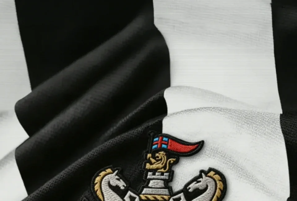
On Tyneside, where the club badge has long carried the weight of city identity as much as football identity, Newcastle United have confirmed a new crest for use from next season.
The change follows more than two years of consultation with supporters, including fan events, focus groups, workshops and surveys. Newcastle said the process was designed to preserve the familiar symbols associated with the club while giving the emblem a clearer, more contemporary form.
The existing design, now 38 years old, has increasingly presented practical problems in the modern game. Its individual details can lose definition or become blurred on mobile screens, in broadcast graphics and in other fast-moving, small-scale digital formats, the club said.
Newcastle’s revised badge remains rooted in the city’s coat of arms, retaining the connection that has shaped the club’s visual identity. The intention is not to sever from the past, but to make those origins more legible for an era in which a crest must work everywhere from a shirt to a phone display.
Chief executive David Hopkinson described the project as both an honour and a major responsibility, given the attachment Newcastle supporters feel towards the symbol. He said he had rarely encountered a club with such pride and passion for its crest.
“Our badge comes from the city’s coat of arms, and it still does,” Hopkinson said. “It respects where we come from, reflects who we are today, and will become an iconic symbol for generations of supporters around the world who believe in it and gather around it.”